The Tree of Life
A couple of weeks ago I made a post about color palettes and the importance of beauty in movies, but I didn't include all of the films I wanted to for the sake of brevity and ease. However, I've had quite a lot of free time on my hands lately, so I decided to create a follow-up post with (almost) all of the movies from my list of most beautiful films ever made. Most of these are a little or a lot lacking in the story department, but I would watch them over and over simply because they're just so god damn easy on the eyes.
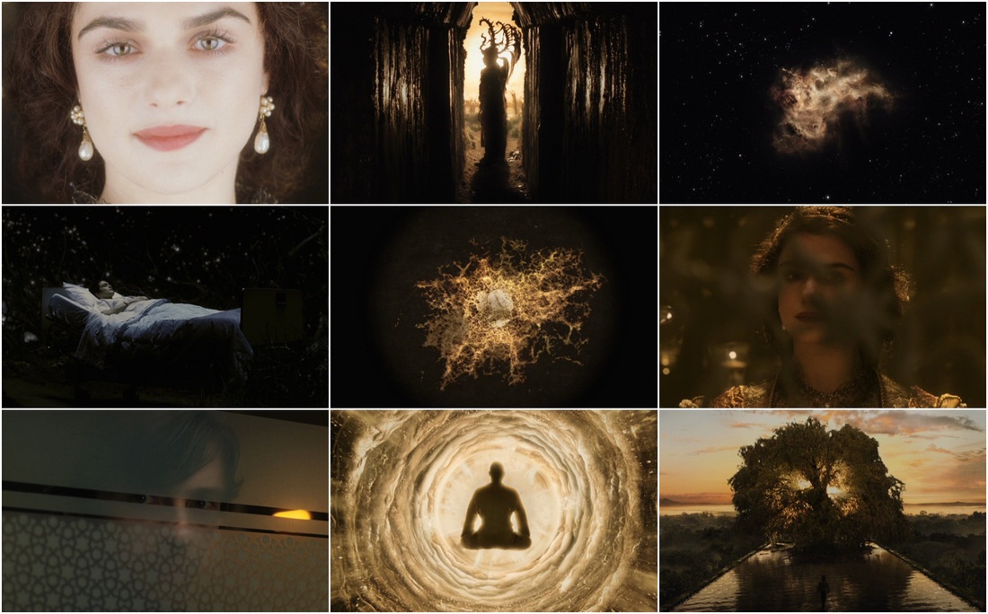
The Tree of Life (2011)
Director: Terrence Malick, Cinematographer: Emmanuel Lubezki
Terrence Malick is notorious for creating wonderfully rich, if not confusing pictures, and it was a near tie between The Thin Red Line and Tree of Life for a spot on the list. I love the work of John Toll, cinematographer of The Thin Red Line, but Emmanuel Lubezki (who also worked on Alfonso Cuarón's Gravity) handles the rich color palette and contrast with such grace that it's literally breathtaking. I have yet to find a sequence to rival the 20-minute history of the universe in this film.
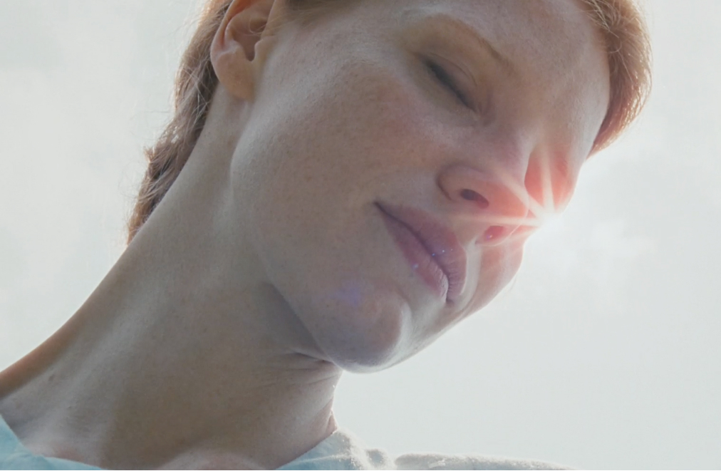
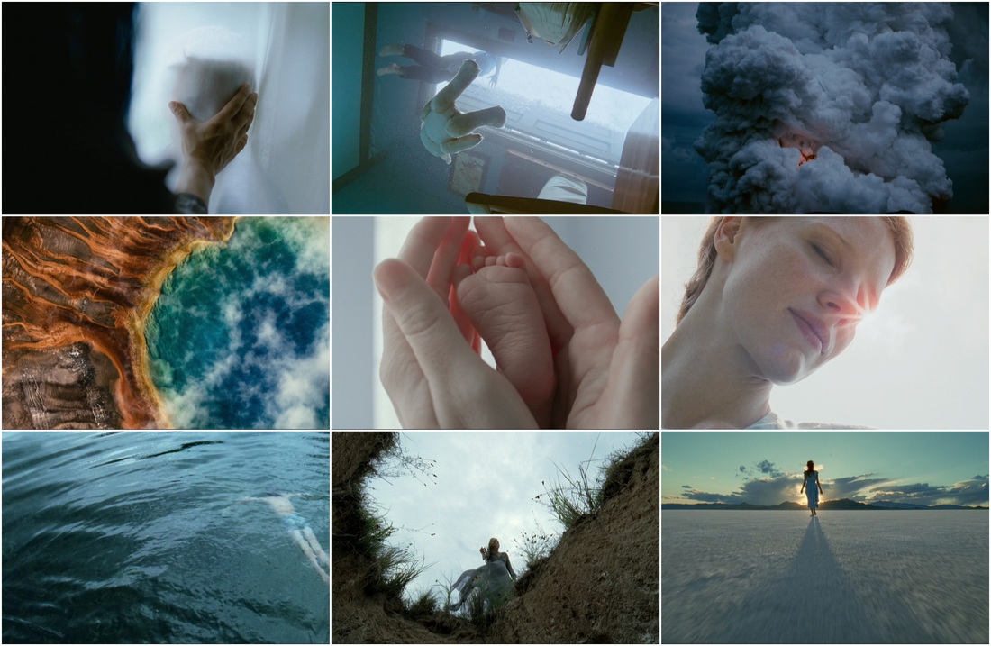
Melancholia (2011)
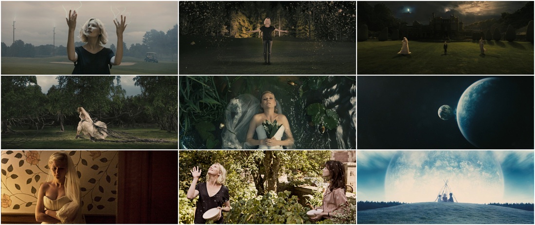
Director: Lars Von Trier, Cinematographer: Manuel Albert Claro
The screencaps of Melancholia don't do the film justice at all. Maybe it's the combination of slow motion shots and the standard von Trier ambience that make this film so appealing, but it has hands down one of the most interesting and visually stunning opening sequences ever made. It's not that the rest of the film isn't good, because it is, it just never tops the first four minutes.
Sin City (2005)
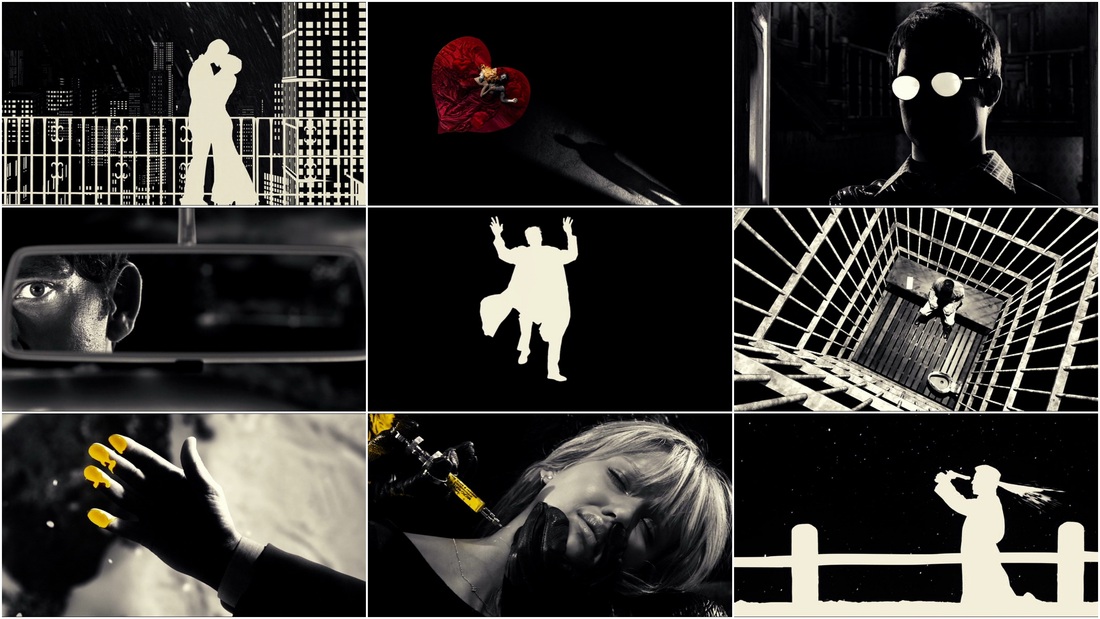
Director/Cinematographer: Robert Rodriguez
While Zack Snyder's Watchmen is a pretty accurate representation of the graphic novel (and superior to Sin City), Sin City is the clear winner when it comes to visuals. The way the graphic novel feel is represented is so stylized and unique that any other movie that used the same techniques would be an obvious knockoff. Frank Miller's style can also be seen in the use of over-the-shoulder dialogue, negative silhouettes, and close up actions. Just a beautifully, beautifully constructed movie thanks to Robert Rodriguez.
The Fountain (2006)
Director: Darren Aronofsky, Cinematographer: Matthew Libatique
The Fountain is an underrated movie as a whole, its connected story lines work much better than Cloud Atlas, and the entire film is bathed in golden light. Libatique and Aronofsky never disappoint with their collaborations, and The Fountain is their magnum opus together, even if it was made with about 1/3 of the funds originally set aside for it.
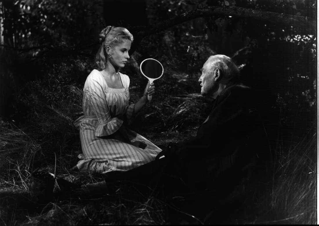
Mr. Nobody (2009)
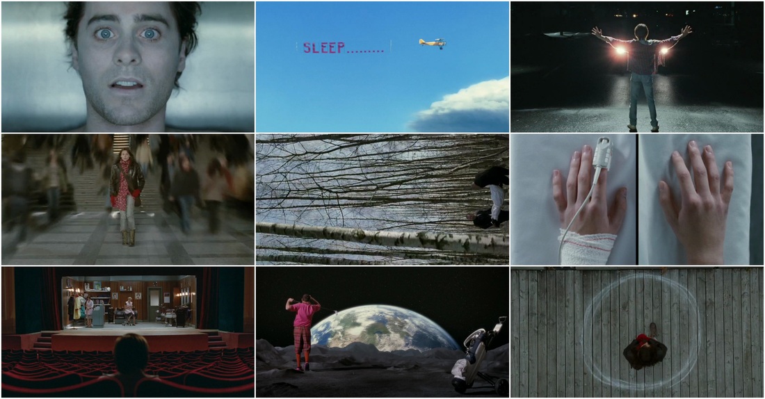
Director: Jaco Van Dormael, Cinematographer: Christophe Beaucarne
Mr. Nobody is a movie that is too long, too weird, and too confusing, but that doesn't change the fact that it looks incredible. One scene in particular, known as "the impossible mirror scene" is particularly impressive, including a shot that tracks in towards the mirror (and reflection of Nemo), then seems to track further in to the mirror, following Nemo's exit. A lot of the film is color coded, and often reminiscent of the Three Colors Trilogy as it spans three possible story lines, creating a surreal, yet aesthetically pleasing journey through the oldest man alive's life.
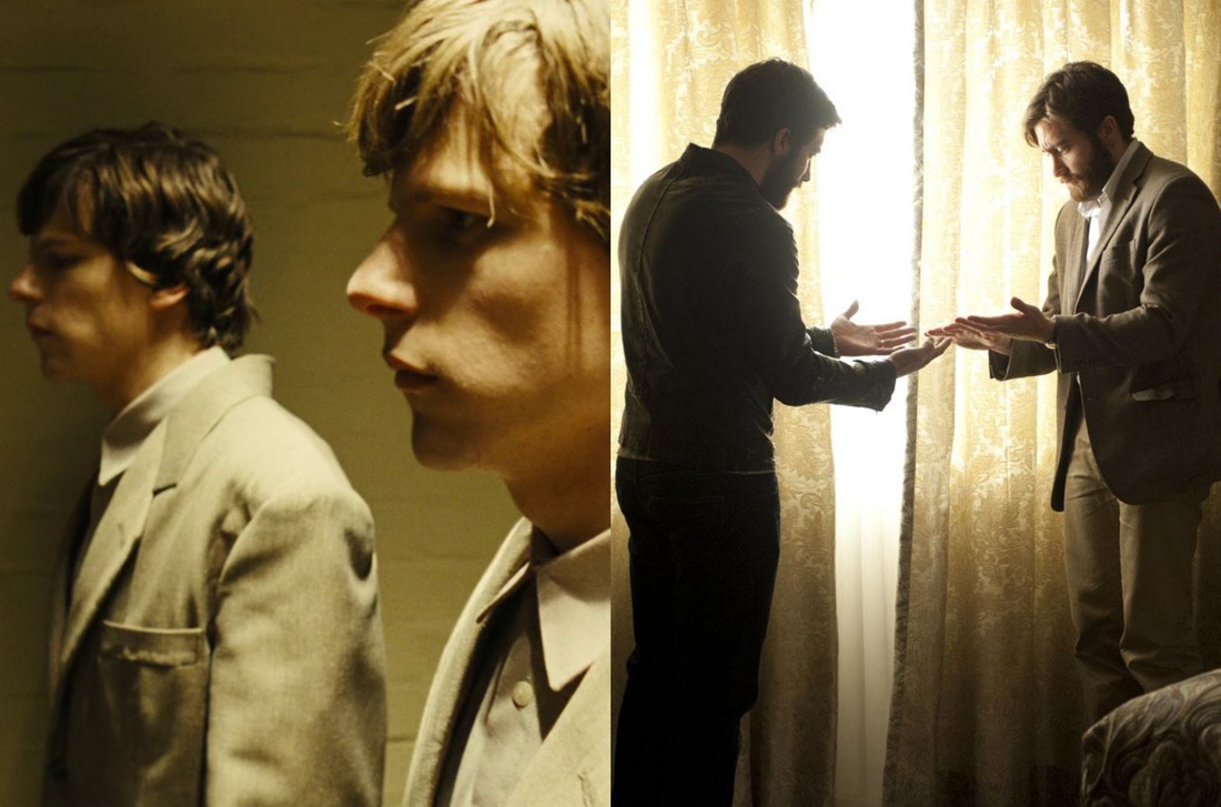
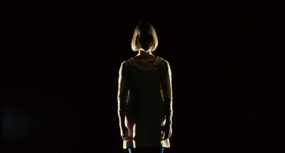
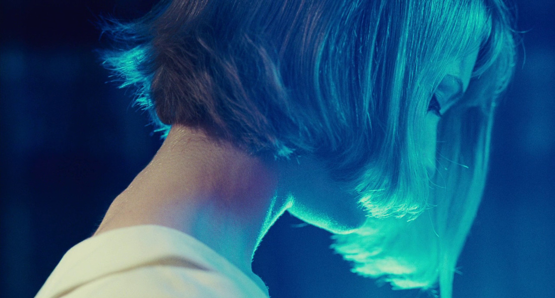
Stoker (2013)
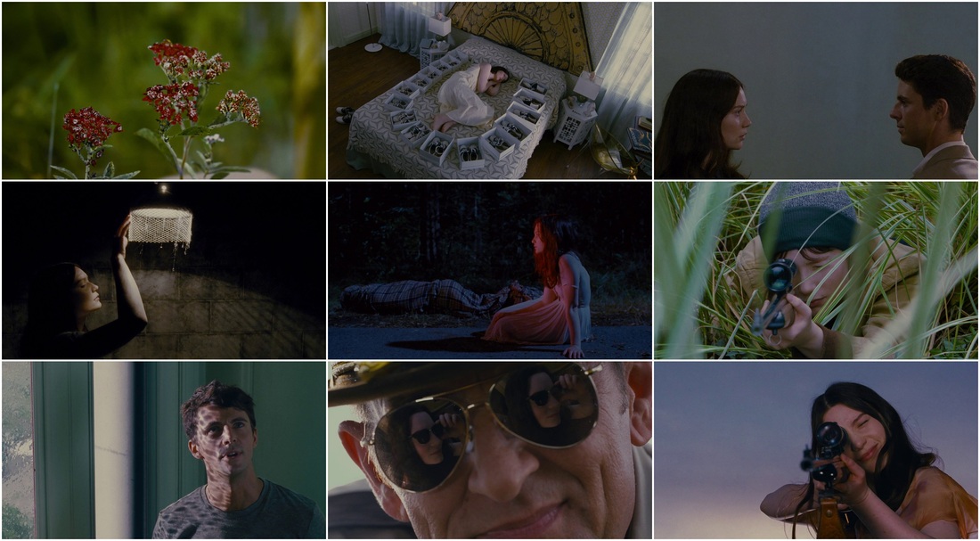
Director: Park Chan-wook, Cinematographer: Chung Hoon-chung
Ah, Stoker. The movie I wanted to like so much. With a cast, director, and hype like that, I had high (maybe too high) expectations going in, and the only thing I felt made it a movie worth watching was the cinematography. It's appropriately creepy, atmospheric, and dark, all while keeping a pastel color palette. And that transition when India brushes her mother's hair? Incredible.
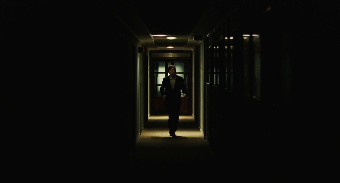
Fargo (1996)
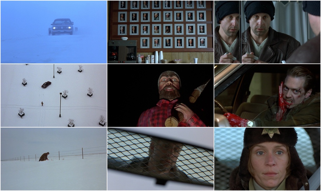
Director: Joel and Ethan Coen, Cinematographer: Roger Deakins
Fargo's setting lends itself to a lot of neat visual tricks, and Deakins capitalizes on all of them. He uses the snow to create the effect of negative space, contrasted by black trees, buildings, and fences, and a natural white light to keep the movie grounded in some version of reality. There's a reason Deakins is hailed as the king of cinematography.


 RSS Feed